About a week ago on the r/SanDiegan subreddit someone posted a link to new data from the City of San Diego on Short-Term Residential Occupancy (STRO) licenses. These data show the addresses and owners of every licensed Airbnb (and other similar arrangements, I guess) in the city. Airbnb’s are a soure of ire among some San Diego residents for supposedly wasting our precious housing supply. My view is that this issue is a bit of a red-herring. Housing in California cities like San Diego is so catastrophically under-supplied due to years of restrictive zoning laws that, even if Airbnbs were all made illegal tomorrow, it wouldn’t make much of a difference.
In this post I’m going to walk through how to make some maps with this STRO data using R. I posted one these maps to Reddit but made an embarrassing error which resulted in the incorrect magnitudes being displayed. Always check your work before posting something online!
Introducing the Data
# Packages
library(dplyr)
library(ggplot2)
library(purrr)
library(tidycensus)
library(sf)
library(tigris)
Our goal is to create a choropleth map of San Diego with regions shaded according to their proportion of STROs. The packages {dplyr} and {ggplot2} are for some light data manipulation and producing the graphs. Inspired by Michael DeCrescenzo’s posts on functional programming in R, I use {purrr} for some currying and composition later in this post. The {tidycensus} package is the best way to access US Census data in my opinion. And {sf} and {tigris} are my two favorite GIS packages in R.
Now let’s take a look at the data.
stro <- readr::read_csv("https://seshat.datasd.org/stro_licenses/stro_licenses_datasd.csv")
stro
# A tibble: 7,828 × 23
license_id address street_number street_number_fraction street_direction
<chr> <chr> <dbl> <chr> <chr>
1 STR-01939L 1633 LAW St… 1633 <NA> <NA>
2 STR-02856L 2315 AVENID… 2315 <NA> <NA>
3 STR-03110L 13680 VIA C… 13680 <NA> <NA>
4 STR-01470L 4291 Corte … 4291 <NA> <NA>
5 STR-02940L 1016 W BRIA… 1016 <NA> W
6 STR-00057L 4767 OCEAN … 4767 <NA> <NA>
7 STR-02180L 2138 REED A… 2138 <NA> <NA>
8 STR-03888L 4212 Florid… 4212 <NA> <NA>
9 STR-00513L 3745 33rd S… 3745 <NA> <NA>
10 STR-02250L 3820 Vermon… 3820 <NA> <NA>
# ℹ 7,818 more rows
# ℹ 18 more variables: street_name <chr>, street_type <chr>, unit_type <chr>,
# unit_number <chr>, city <chr>, state <chr>, zip <dbl>, tier <chr>,
# community_planning_area <chr>, date_expiration <date>, rtax_no <chr>,
# tot_no <dbl>, longitude <dbl>, latitude <dbl>,
# local_contact_contact_name <chr>, local_contact_phone <dbl>,
# host_contact_name <chr>, council_district <dbl>Looks like we’ve got around 7828 STRO licenses currently active in San Diego. But where are they concentrated? Luckily for our geo-spatial aspirations, the longitude and latitude values for these addresses are already contained in the data. If longitude and latitude weren’t included we would have to use a tool like the Census geocoder or plug the addresses into ArcGIS. These longitude and latitude values will let us figure out in which Census tract these addresses are located, thereby allowing us to map their density.1
Geo-spatial Merging
The first step in linking addresses to tracts is loading in a shapefile containing the boundaries of the Census tracts in San Diego county. The {tigris} package conveniently has a tracts() function which gives us exactly what we need. We are also going to save the coordinate-reference-system (CRS) of this tracts object for later use. Dealing with CRS’s is the source of a lot of GIS headaches. Without a common CRS, the various data sources we’re assembling in this project won’t be able to spatially match up with one another. The target_crs object will help us deal with this issue.
sd_tracts <- tracts(state = "CA", county = "San Diego",
                    progress_bar = FALSE)
Retrieving data for the year 2021target_crs <- st_crs(sd_tracts)Now we want to use st_join() to match the census tracts in sd_tracts with the addresses in our stro data frame. But first we need to convert the stro object into a shapefile using st_as_sf(). Note how we set crs = target_crs below to ensure that the shapefile version of stro is using the same CRS as our tracts data. The st_as_sf() function will error if any rows are missing coordinates, so we filter out the NA addresses first (these mostly seem to be duplicates in the original STRO data for some reason). Now we’re all set to st_join() in the tracts data, thereby matching each STRO address with the Census tract in which it is located.
stro_geo <- stro |>
  filter(!is.na(longitude)) |>
  st_as_sf(coords = c("longitude", "latitude"),
           crs = target_crs,
           remove = FALSE) |>
  st_join(sd_tracts)
The variable for Census tract in the stro_geo shapefile/data frame is GEOID. This is an 11 digit value comprised of the two-digit state code (“06” for California), followed by the three-digit county code (“073” for San Diego county), followed by a six-digit tract code. We’ll perform a simple group-by and summarise operation to calculate the total number of STRO licenses in each tract using this GEOID variable. The st_drop_geometry() function gets rid of the spatial boundaries for each tract in our data. We don’t need those anymore because we’ll be merging by GEOID from now on.
stro_geo <- stro_geo |>
  group_by(GEOID) |>
  summarise(total_licenses = n()) |>
  st_drop_geometry()
stro_geo
# A tibble: 301 × 2
GEOID total_licenses
* <chr> <int>
1 06073000100 22
2 06073000201 23
3 06073000202 74
4 06073000301 37
5 06073000302 18
6 06073000400 26
7 06073000500 49
8 06073000600 40
9 06073000700 61
10 06073000800 55
# ℹ 291 more rowsIf we were to map out the total_licenses variable as it stands, we would probably end up with something that looks basically like a population map. Tracts with more total housing units will simply have more STRO permits to give out. Instead, we need to divide the total licenses in each tract by the total housing units, thereby giving us the proportion of housing devoted to STRO licenses. We can get the total housing units, by tract, using the get_acs() function in the {tidycensus} package. In order to grab Census data in this way, you will have to sign up for a Census API key (see here for more information). The variable for housing units in the American Community Survey (ACS) is “B25001_001E”, which we can rename “total_housing_units” within the API call.2
sd_acs <- get_acs(
  geography = "tract",
  variables = c("total_housing_units" = "B25001_001E"),
  state = "CA",
  county = "San Diego",
  geometry = TRUE,
  output = "wide",
  progress_bar = FALSE
)
Getting data from the 2017-2021 5-year ACSDownloading feature geometry from the Census website. To cache shapefiles for use in future sessions, set `options(tigris_use_cache = TRUE)`.We’re also going to include geometry = TRUE in our API call so we get the tract boundaries for plotting later. Unfortunately, these geometries are quite coarse and “blocky”. If we want to see all of the nice intricate geographic details in San Diego’s Mission Bay, for example, we’ll need to use the erase_water() function from {tigris}. For some reason erase_water() messes up the Census shapefile geometries but we can fix that with {sf}’s st_make_valid().
sd_acs <- sd_acs |>
  st_transform() |>
  erase_water(year = 2021) |>
  st_make_valid() # Water makes the geometries wonky
Fetching area water data for your dataset's location...Erasing water area...
If this is slow, try a larger area threshold value.The last step before making some cool maps is to join our ACS data to the geocoded STRO data. The argument geography = "tract" in get_acs() above ensures that the GEOIDs in that data will match up with the tract GEOIDs in our STRO data. If we left-join the STRO data into the ACS data we will keep all tracts in San Diego in the resulting data frame. Tracts without any STRO licenses will have NA values for the total_licenses variable, which we can turn into 0’s with tidyr::replace_na().
sd <- sd_acs |>
left_join(stro_geo, by = "GEOID") |>
mutate(total_licenses = tidyr::replace_na(total_licenses, 0),
prop_stro = total_licenses / total_housing_units,
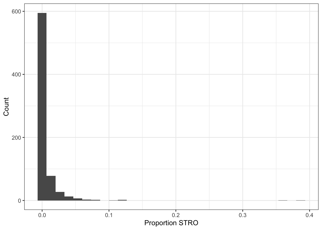
log_prop_stro = log(prop_stro))Then we can calculate tract-level STRO proportions by dividing the total_licenses by the total_housing_units. We also want to generate a variable for the log of this proportion. As Figure 1 shows, STRO licenses are heavily skewed towards certain neighborhoods. Up to 38.7% of housing units in some beach areas of San Diego are devoted to STROs, whereas I’m not sure why anyone would want to rent an Airbnb in Kearny Mesa. Taking the natural log of our STRO proportion variable will help show distinctions much more clearly when it comes to making the choropleth map.
Mapping Functions
It’s almost time to make some maps! We will be making several versions using the same basic template, so this calls for writing our own function. The custom function make_log_prop_stro_map() below takes a data frame as input (our sd object in this case) and outputs a beautiful choropleth map with Census tracts shaded according to their STRO proportion. Most of the heavy lifting in this function is done by geom_sf(). This function recognizes the spatial geometries in our data and draws the borders for each tract. The argument lwd controls the thickness of these borders. I tried playing around with this option so that the border thickness is a function of the number of tracts in the input data. The more tracts, the thinner the border should be so that things don’t get too crowded. This will be relevant in a minute when we zoom in on different areas of San Diego.
make_log_prop_stro_map <- function(input_data) {
  p <- ggplot(input_data) +
    aes(fill = log_prop_stro) +
    geom_sf(color = "black", lwd = 50 / nrow(input_data)) +
    theme_void() +
    scale_fill_viridis_log_prop_stro() +
    labs(title = "Proportion of Short Term Rental Licenses\nby Total Households per Census Tract")
  return(p)
}

scale_fill_viridis_log_prop_stro <- partial(
  scale_fill_viridis_c,
  labels = function(x) round(exp(x), 3),
  breaks = log(c(0.005, 0.02, 0.1, .30)),
  name = "Proportion",
  option = "B",
  na.value = "grey")
You might be wondering what’s going on with scale_fill_viridis_log_prop_stro(). This is another function we are writing in order to control the color palette and legend in our map. The partial() function from the {purrr} package takes a function and returns a new function which is a copy of the original function with new default arguments. In this case, we’re taking {ggplot2}’s scale_fill_viridis_c() and adding some options which suit the type of map made by make_log_prop_stro_map(). One of the key arguments is labels = function(x) round(exp(x), 3). By exponentiating our logged proportion STRO variable, we ensure that the legend labels on our map will be in the original, non-logged units. Using “partial” functions opens up a lot of possibilities in your coding. We could now use scale_fill_viridis_log_prop_stro() in other similar plots without copying and pasting a bunch of specific scale_fill_viridis_c() arguments if we wanted to. Read about this here if you’re interested in learning more about partial, or curried functions.
The Maps
Okay now it is FINALLY time to make some maps!
make_log_prop_stro_map(sd)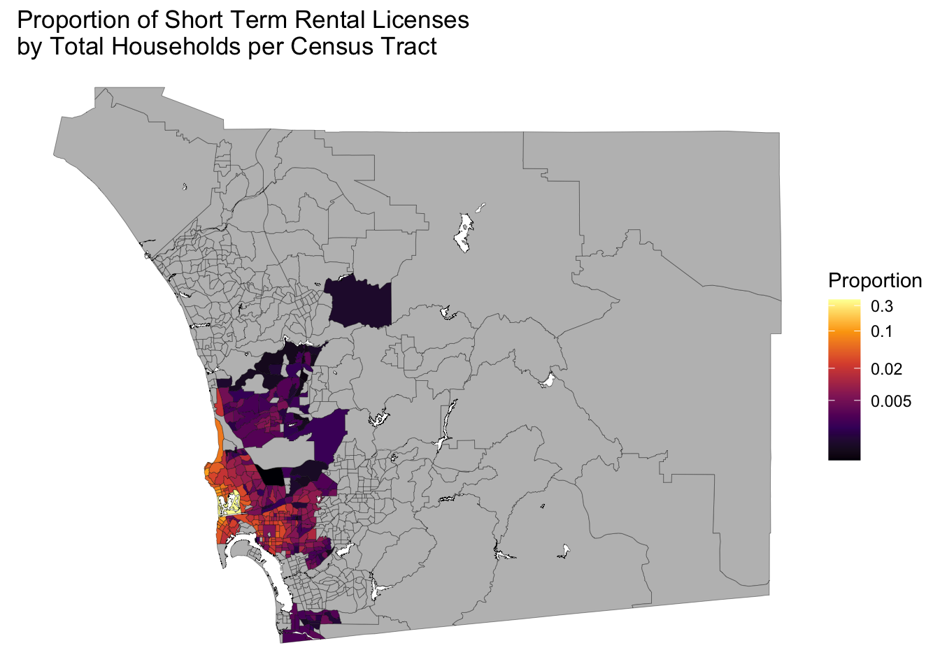
Wow, San Diego county is really big and we only have data for a small part of it. All those grey shaded regions either have zero STROs or they are not included in the San Diego city data set we started with. Perhaps if we squint really hard we can make out some geographic patterns.
Wouldn’t it be nice if we could zoom in a bit? I experimented with a lot of different methods for accomplishing this, such as restricting the Census data to tracts in the place of San Diego city, but the easiest method I found involved using st_crop() to filter out data which lies outside a box defined by four longitude and latitude points. To find the desired longitude and latitude points, you can use something like Google maps or you can make the map using theme_bw() as shown in Figure 3 and go from there.
make_log_prop_stro_map(sd) +
  theme_bw()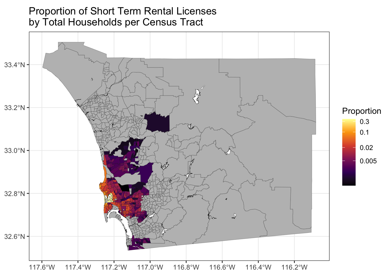
In keeping with our functional programming style, we’ll write some curried functions to accomplish the cropping. The functions st_crop_sd() and st_crop_central_sd() use my painstakingly chosen longitude and latitude values as defaults in the st_crop() function.
st_crop_sd <- partial(
  st_crop,
  xmin = -117.3, xmax = -116.99,
  ymin = 33, ymax = 32.4
)

st_crop_central_sd <- partial(
  st_crop,
  xmin = -117.3, xmax = -117,
  ymin = 32.88, ymax = 32.67)
There are a few ways we could use our new crop functions. We could take the sd data frame, pipe it into st_crop_sd() then pipe that into make_log_prop_stro_map(). But instead we are going to try to fully embrace a functional programming style approach by using function composition to make our final maps. The compose() function from {purrr} allows us to combine two functions together, evaluating one and then the other. The code below applies the st_crop_sd function to the sd object and then applies make_log_prop_stro_map() to the cropped data frame.3 The result is Figure 4. Nice, we successfully filtered out all those Census tracts in San Diego county with no data, thereby showing the STRO density much more clearly!
compose(make_log_prop_stro_map, st_crop_sd)(sd)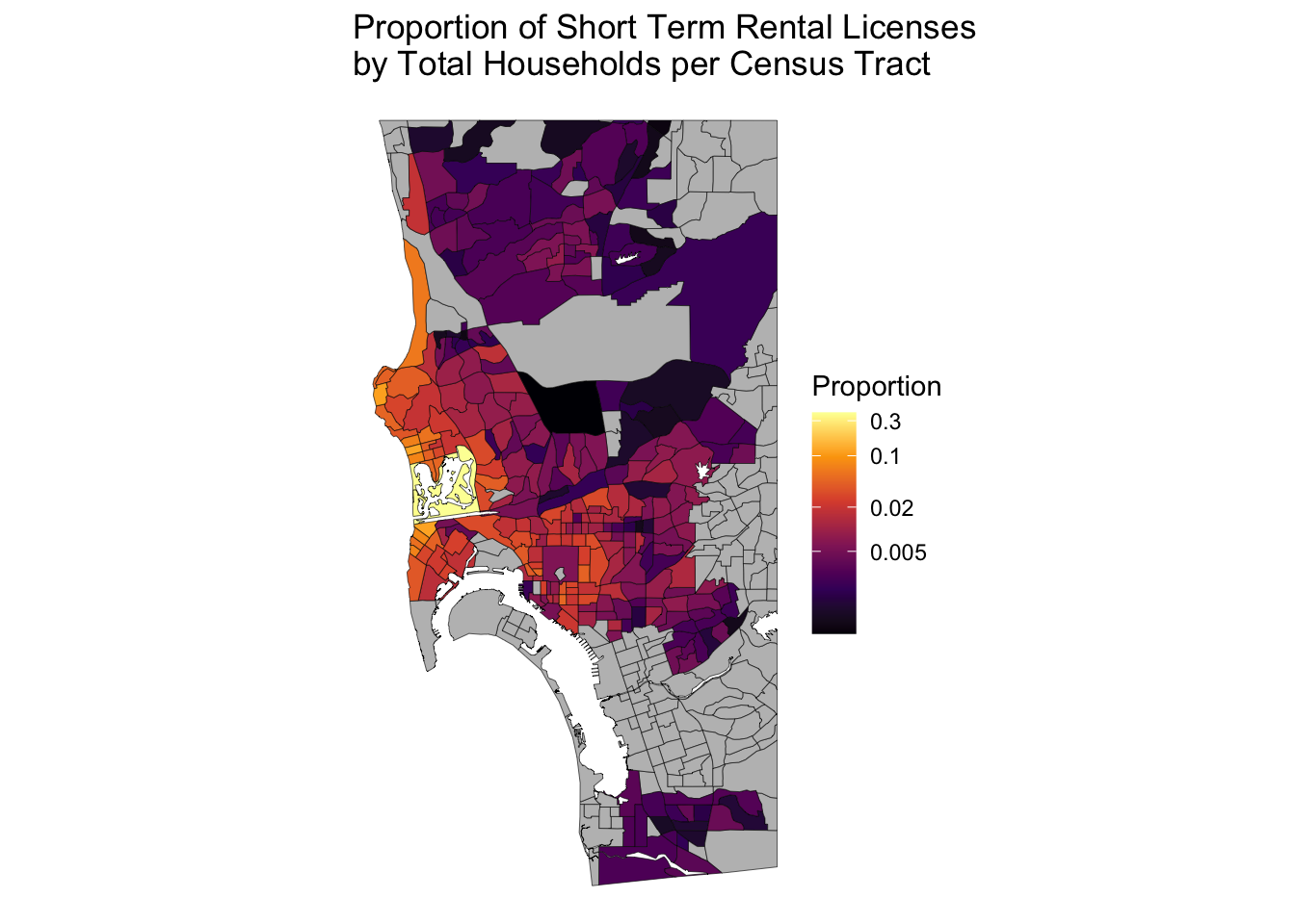
We can zoom in even further with st_crop_central_sd() in Figure 5. Looks like there are a ton of Airbnbs in Mission Bay and parts of Pacific Beach. Obviously these are desirable vacation spots in San Diego, but these neighborhoods are also comprised mostly of 1-2 story apartments/houses. If we legalized denser housing here maybe more people could live within walking distance of the beach. Wouldn’t that be nice!
compose(make_log_prop_stro_map, st_crop_central_sd)(sd)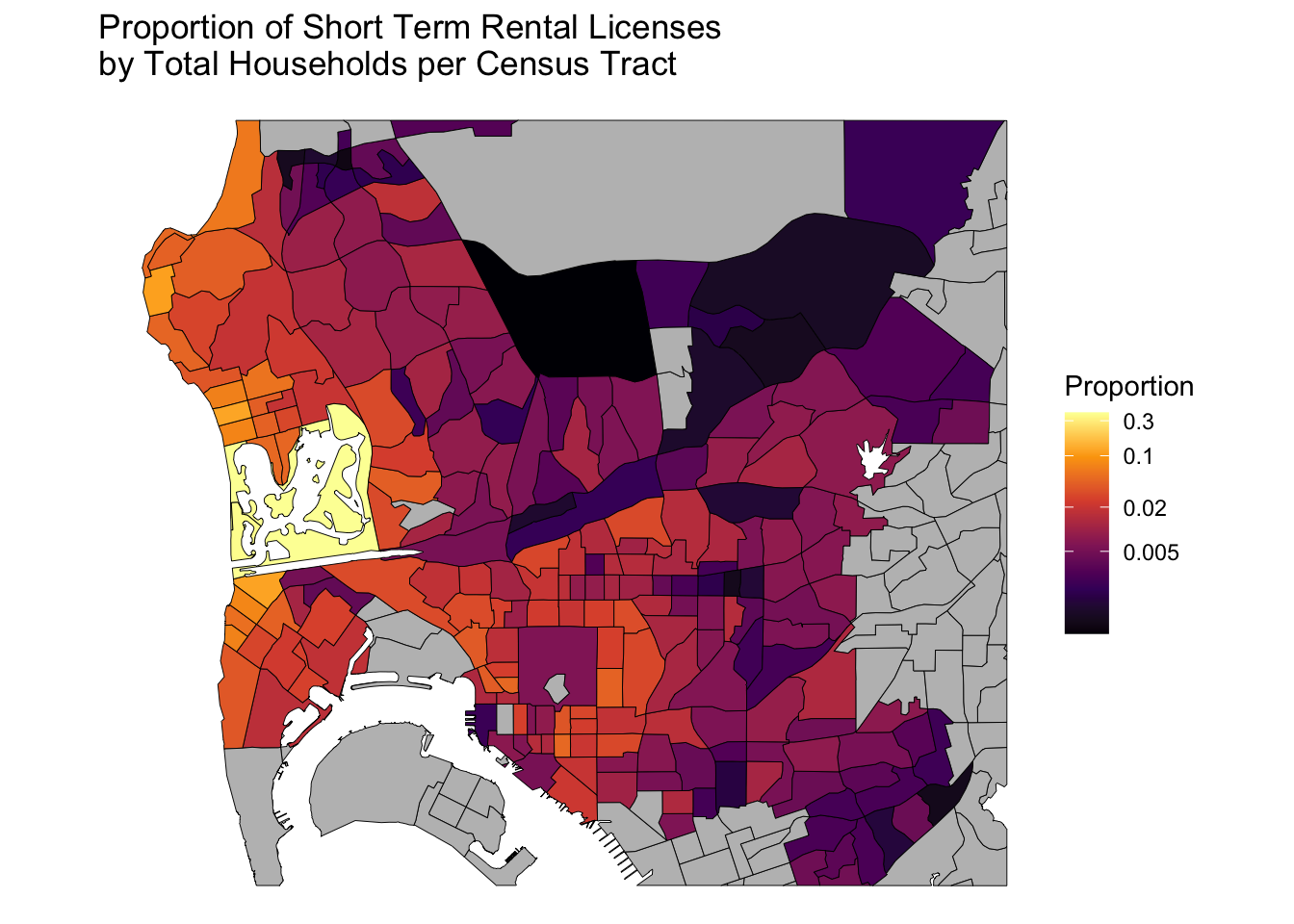
And that’s how you can make nice-looking choropleth maps in R using geocoded data.
So is Airbnb the big villain some make it out to be? Using the Census API call below we see that San Diego City has 545,792 total housing units. The STRO data contain around 7828 licenses, which comes out to 1.4% of the total housing stock. It’s going to take a lot more supply than that to make housing affordable in San Diego. Instead of focusing on Airbnbs, maybe we should work towards supporting things that could really make a difference like SB-10.
get_acs(
  geography = "place",
  variables = c("total_housing_units" = "B25001_001E"),
  state = "CA",
  output = "wide"
) |>
  filter(NAME == "San Diego city, California")
# A tibble: 1 × 4
GEOID NAME total_housing_units B25001_001M
<chr> <chr> <dbl> <dbl>
1 0666000 San Diego city, California 545792 2846sessionInfo()R version 4.1.1 (2021-08-10)
Platform: x86_64-apple-darwin17.0 (64-bit)
Running under: macOS Big Sur 10.16
Matrix products: default
BLAS: /Library/Frameworks/R.framework/Versions/4.1/Resources/lib/libRblas.0.dylib
LAPACK: /Library/Frameworks/R.framework/Versions/4.1/Resources/lib/libRlapack.dylib
locale:
[1] en_US.UTF-8/en_US.UTF-8/en_US.UTF-8/C/en_US.UTF-8/en_US.UTF-8
attached base packages:
[1] stats graphics grDevices utils datasets methods base
other attached packages:
[1] tigris_2.0.3 sf_1.0-9 tidycensus_1.4.1 purrr_1.0.1
[5] ggplot2_3.4.1 dplyr_1.1.0
loaded via a namespace (and not attached):
[1] Rcpp_1.0.10 tidyr_1.3.0 class_7.3-19 digest_0.6.31
[5] utf8_1.2.3 R6_2.5.1 evaluate_0.20 e1071_1.7-12
[9] httr_1.4.5 pillar_1.9.0 rlang_1.1.0 curl_5.0.0
[13] uuid_1.1-0 rstudioapi_0.14 rmarkdown_2.21 labeling_0.4.2
[17] readr_2.1.4 stringr_1.5.0 htmlwidgets_1.6.2 bit_4.0.5
[21] munsell_0.5.0 proxy_0.4-27 compiler_4.1.1 xfun_0.39
[25] pkgconfig_2.0.3 htmltools_0.5.5 tidyselect_1.2.0 tibble_3.2.1
[29] fansi_1.0.4 viridisLite_0.4.1 crayon_1.5.2 tzdb_0.3.0
[33] withr_2.5.0 wk_0.7.1 rappdirs_0.3.3 grid_4.1.1
[37] jsonlite_1.8.4 gtable_0.3.1 lifecycle_1.0.3 DBI_1.1.3
[41] magrittr_2.0.3 units_0.8-1 scales_1.2.1 KernSmooth_2.23-20
[45] cli_3.6.1 stringi_1.7.12 vroom_1.6.0 farver_2.1.1
[49] xml2_1.3.3 ellipsis_0.3.2 generics_0.1.3 vctrs_0.6.2
[53] s2_1.1.1 tools_4.1.1 bit64_4.0.5 glue_1.6.2
[57] hms_1.1.2 parallel_4.1.1 fastmap_1.1.1 yaml_2.3.7
[61] colorspace_2.0-3 classInt_0.4-8 rvest_1.0.3 knitr_1.42 Footnotes
As someone mentioned in my Reddit post, there are alternative ways to map the density of geo-spatial data—such as plotting the points directly on the map. The way I’m doing it here runs the risk of running into the Modifiable areal unit problem↩︎
In the version of the final map I posted to Reddit, I accidentally used the ACS variable for total households. This corresponds to sets of people living in each Census tract, rather than physical housing units. Total physical housing units will generally be more than total households because many units will be vacant at any given time. The two variables, however, appear to be roughly proportional to one another. So the map I originally posted was incorrect in terms of magnitude but shows a similar pattern of STRO density as the corrected map.↩︎
Again, Michael DeCrescenzo has a nice post on function compostion here: https://mikedecr.netlify.app/blog/composition/↩︎